Mastering Framer Animation: In-Depth Guide
Master Framer Animation with this in-depth guide, learn smooth transitions, interactive effects, and pro techniques to elevate your UI/UX designs effortlessly.

What Is Animation?
Animation in web design is the movement or transition of elements on a webpage to make the experience more engaging and interactive. Instead of static layouts, animations add motion like fading in content or scaling buttons on hover to create a dynamic feel. Beyond visual appeal, animation helps guide attention, provide feedback, and make interactions smoother and more intuitive for users.
Introduction to Framer Animation
Framer animation allows designers to create smooth, interactive website experiences without writing complex code. With built-in features like variants, transitions, and scroll effects, Framer makes it easy to add motion to elements such as buttons, images, and sections. Whether it's a simple hover effect or a scroll-based transformation, Framer provides a visual and intuitive way to design modern, dynamic interfaces that feel responsive and engaging.
In this section, we’ll start by creating a simple and practical animation in Framer — the Hover Effect.
How To Create a Hover Animation with Frame Animation?
Creating a hover animation with Framer Animation is a simple way to add interactivity and polish to your UI. By defining how an element responds when a user hovers over it, you can create smooth transitions, highlight important elements, and improve overall user experience with minimal effort.
Now, let's begin the guide.
Hover Animation
The hover effect is one of the most commonly used animations in web design. It adds interactivity and gives users visual feedback when they move their cursor over an element.
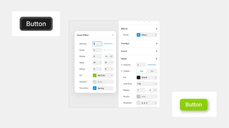
Step 1: Create a Button Layout
First, create a simple button design on your canvas. You can choose any style you like adjust the size, background color, border radius, and text according to your design preference.
Step 2: Select the Button
Click on the button you just created so its properties appear in the right-side panel.
Step 3: Add Hover Effect
In the right panel, go to the Effects section and click on Hover to add a hover state.
Step 4: Adjust Hover Properties
Now customize the hover state. For example, you can:
Change the background color
Adjust scale
Modify shadow
Add slight movement
In this example, I am changing the button color to green on hover to clearly show the interaction effect.
Press Effect in Framer
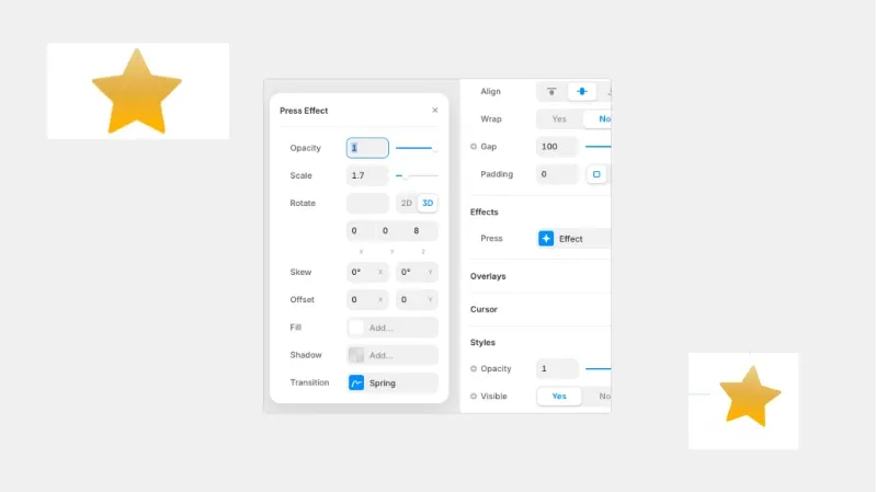
Step 1: Create a Shape
First, add a shape to your canvas (for example, a star). Adjust its size, color, and layout as per your design preference.
Step 2: Select the Shape
Click on the shape so its settings appear in the right-side properties panel.
Step 3: Add Press Effect
In the right panel, scroll to the Effects section and click on Press → Effect.
This opens the Press Effect settings panel, as shown in the image.
Step 4: Adjust Press Effect Properties
Inside the Press Effect panel, you can modify:
Opacity – Controls transparency when pressed
Scale – Adjust size during press
Rotate (2D / 3D) – Add rotation effect
Skew – Distort slightly for a dynamic feel
Offset (X / Y) – Move shape position
Fill & Shadow – Change colour or shadow on press
Transition (Spring) – Controls animation behaviour
Loop Effect in Framer
Step 1: Create or Add a Shape/Image
First, add a shape or image to your canvas (as shown in the example). Adjust its size and layout according to your design.
Step 2: Select the Element
Click on the element so its settings appear in the right-side properties panel.
Step 3: Add Loop Effect
Scroll to the Effects section and click on Loop → Effect.
This opens the Loop Effect settings panel, as shown in the image.
Step 4: Adjust Loop Effect Properties
Inside the Loop Effect panel, you can configure:
Type (Loop / Mirror) –
Loop repeats from start to end continuously.
The mirror plays forward and then reverses back smoothly.
Delay – Set time before the loop starts (e.g., 0s).
Opacity – Animate transparency.
Scale – Create a subtle pulse effect.
Rotate (2D / 3D) – Add continuous rotation.
Skew – Add slight distortion if needed.
Offset (X / Y) – Move the element up, down, left, or right repeatedly.
(In the image example, the Y offset is set to -10 for a floating effect.)
Off Screen (Play / Pause) – Control whether animation continues when not visible.
Transition (Ease In Out) – Controls animation smoothness.
Appear Effect in Framer
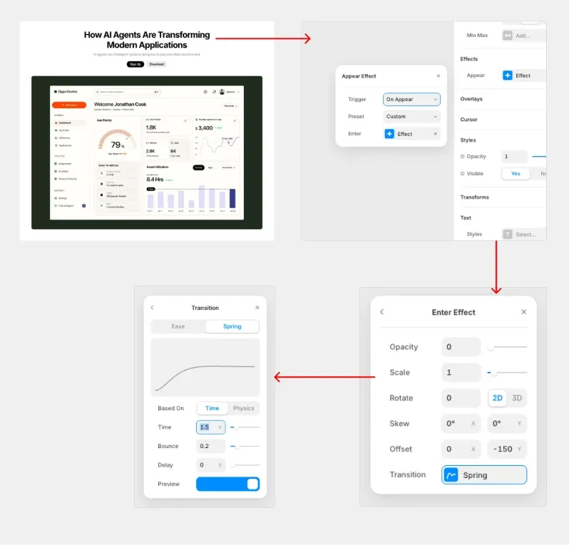
Step 1: Add and Select the Heading
First, add your Heading text (for example: “How AI Agents Are Transforming Modern Applications”) to the canvas.
Click on the heading so its properties appear in the right-side panel.
Step 2: Add the Appear Effect
Scroll to the Effects section in the right panel.
Click on Appear → + Effect.
This opens the Appear Effect settings panel (as shown in the image).
Step 3: Configure Appear Settings
Inside the Appear Effect panel:
Trigger: Set to On Appear
Preset: Choose Slide in Top
Enter: Click + Effect to define how the heading enters
Step 4: Adjust Enter Effect Settings
After clicking Enter → Effect, configure the following (based on the image):
Opacity: Set to 0 (so the heading fades in)
Scale: Keep at 1
Rotate: 0 (2D selected)
Offset Y: Set to 150 (heading moves upward into position)
Transition: Select Spring
This creates a smooth upward slide + fade-in effect.
Step 5: Adjust Transition Settings
Inside the Transition panel:
Choose Spring
Based On: Time
Time: 1.5s
Bounce: 0.2
Delay: 0s
This gives the heading a soft, natural motion when it appears.
Subtext Animation
Step 1: Add Appear Effect
Scroll to the Effects section.
Click Appear → + Effect.
Step 2: Configure Appear Settings
Trigger: On Appear
Preset: Choose Slide in Bottom
Enter: Click + Effect
Step 3: Adjust Enter Effect
Opacity: 0
Scale: 1
Rotate: 0 (2D)
Offset Y: 20–40
Transition: Spring
Step 4: Add Small Delay
In the Transition (Spring) settings:
Based On: Time
Time: 1.5s
Bounce: 0.2
Delay: 0.5s
Apply the same animation settings to the image’s Appear effect, but remove the 0.5s delay. Keep all other properties exactly the same to maintain consistency in the animation style.
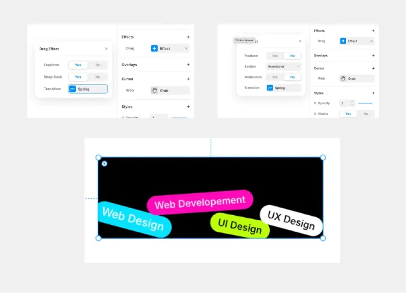
Drag Effect in Framer
In this example, we are applying the Drag effect to each individual tag (like “Web Design”, “UI Design”, etc.) instead of the main container.
Step 1: Create the Tags
Add rounded rectangles (or frames).
Add text inside each one (Web Design, UI Design, UX Design, etc.).
Style them with background colors and border radius.
Each tag should be a separate layer.
Step 2: Select an Individual Tag
Click on one tag (for example, “Web Design”) so its properties appear in the right-side panel.
Step 3: Add Drag Effect
Scroll to the Effects section.
Click Drag → + Effect.
The Drag Effect panel will open
If Freeform Yes
The tag can move freely in all directions (X and Y).
Users can drag it anywhere on the canvas.
Best for playful, interactive designs.
Example: Users can move each tag randomly around the section.
When applying the Drag effect to individual tags, you may want to restrict their movement within a specific area instead of allowing free movement.
If Freeform = No
When you set Freeform to No, the element cannot move freely in all directions. Instead, you need to define a boundary to control where the element can be dragged.
How to Set a Drag Boundary
Step 1: Create a Scroll Section (Boundary Area)
Add a Scroll Section to your canvas.
This section will act as the boundary container for your draggable elements.
Step 2: Assign an ID to the Section
Select the Scroll Section.
In the right panel, assign an ID (for example: #container).
Step 3: Apply Drag Effect to the Tag
Select the individual tag.
Go to Effects → Drag → + Effect.
Set Freeform = No.
In the Section field, enter the ID of the boundary section (for example: #container).
Additional Important Settings
Snap Back = Yes
→ The tag returns to its original position after release.
Snap Back = No
→ The tag stays where the user drops it.
Momentum = Yes
→ Adds smooth inertia effect when released.
Transition = Spring
→ Moves feel smooth and natural.
When previewed:
Each tag can be dragged independently.
With Freeform ON → Tags move freely.
With Freeform OFF → Tags stay controlled within the layout.
This creates a fun, interactive UI section where users can physically interact with each label.
Ease-In Curve Animation
In Framer, easing controls how an animation accelerates and decelerates during movement. Different easing types create different motion styles, which directly affect how smooth, playful, or dynamic an animation feels.
Linear – Moves at a constant speed from start to finish. Best for continuous animations like loaders or rotations.
Ease In – Starts slowly and speeds up toward the end. Ideal for elements smoothly entering the screen.
Ease Out – Starts fast and gradually slows down before stopping. Perfect for buttons and interactive UI elements.
Ease In Out – Starts slow, speeds up in the middle, then slows again at the end. Most commonly used for smooth and natural animations.
Back In – Slightly moves backward before moving forward. Adds a subtle, playful anticipation effect.
Back Out – Moves slightly past the final position, then settles back. Creates a soft overshoot effect.
Back In Out – Combines backward motion at the start and overshoot at the end. Best for expressive and dynamic animations.
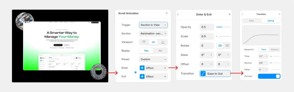
Scroll Animation
Select the element/section you want to animate.
In the right panel, open Scroll Animation.
Set Trigger to Section in View.
Choose the correct Section (e.g.,
#animation-section).Under Viewport, pick the viewport mode you want (top/middle/bottom as needed).
Set Replay to Yes (so it plays again when re-entering the view).
Set Preset to Custom.
Under Enter, click Effect.
In Enter & Exit settings, adjust the values you want (commonly):
Opacity (e.g., start at
0.5→ end at1)Scale (e.g., start at
0.5→ end at1)Rotate (optional,
2Dor3D)Skew / Offset (optional)
Click Transition (inside Enter & Exit), then switch the transition type from Ease to Spring.
Under Based On, choose Time, then set:
Time:
1.7sBounce:
0.2Delay:
0sTurn on Preview to test.
Use the Fade In preset for images to create a smooth and subtle entrance effect.
Tips for Creating Smooth Animations in Framer
Keep it subtle – Small movements feel more professional than dramatic ones.
Stay consistent – Use similar timing and transitions across your project.
Use Spring wisely – A low bounce (0.1–0.3) creates natural motion.
Guide attention with delay – Animate headings first, then supporting elements.
Don’t over-animate – Focus on important and interactive elements only.
Always preview – Test speed and smoothness before publishing.
Conclusion
Animation enhances usability, improves feedback, and makes websites feel modern and interactive.
By learning Hover, Press, Loop, Appear, Drag, easing curves, and Scroll animations in Framer, you now have the core tools needed to create engaging UI experiences.
Use motion thoughtfully, keep it consistent, and focus on purpose over decoration. Smooth, meaningful animation is what makes great design stand out.
