Filters
Featured
Filter by Template
Framer Card Components
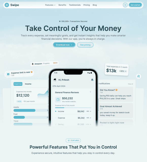
Framer Card Components are reusable Framer Components that help you build modern cards for features, services, products, teams, blogs, and portfolios with clean, customizable layouts.
✅ Trusted by Great Companies & Customers


Best Value
All-Access
$149
$599
Unlimited access to every template, block, and component in the
Framespark ecosystem - with free lifetime updates.



Best Value
All-Access
$149
$599
Unlimited access to every template, block, and component
in the Framespark ecosystem - with free lifetime updates.
Best Value
All-Access
$149
$599
Unlimited access to every template,
block, and component in the
Framespark ecosystem -
with free lifetime updates.
Framer Card
Framer Card is a reusable Framer Card Component designed to display content in clean, organized, and visually engaging layouts. Whether you're showcasing services, features, team members, blog posts, portfolios, pricing, testimonials, or products, cards help organize information while creating a modern browsing experience.
Built for Framer's visual editor, every Framer Card Component is created using reusable Framer Components and can be customized without writing code. From simple content cards and media cards to feature highlights and interactive layouts, Framer Card makes it easy to build professional websites with reusable UI elements that improve consistency and usability.
What is Framer Card?
A Framer Card is a reusable UI component that groups related content inside a structured container. It helps organize information into visually distinct sections, making websites easier to browse while improving readability and user experience.
Instead of manually designing every content block, creators can use reusable Framer Card Components to build consistent layouts across landing pages, portfolios, ecommerce websites, SaaS products, and business websites.
A typical Framer Card component includes:
Hover animations
Image zoom effects
Elevation or lift effects
Background transitions
Overlay animations
Icon animations
Smooth motion effects
Built using reusable Framer Components, every Card component can be customized to match your brand, design system, and website style.
Why Use Framer Card Component?
Well-designed cards help organize information into visually appealing sections that are easy to scan and understand. Framer Card Components provide flexible layouts that improve usability while maintaining a clean, modern interface.
Increase User Engagement: Encourage visitors to interact with cards through smooth hover animations.
Built for Framer: Customize every Card Hover component using reusable Framer Components without writing code.
Modern User Experience: Add polished interactions that make your website feel more premium and dynamic.
Highlight Important Content: Draw attention to featured services, products, portfolios, or team members.
Fully Responsive: Deliver a consistent browsing experience across desktop, tablet, and mobile devices.
Easy Customization: Modify animations, colors, typography, spacing, and layouts directly inside Framer.
Performance Optimized: Lightweight hover effects designed to maintain fast website performance.
Features
Flexible Card Layouts: Build content-rich cards for products, services, blogs, portfolios, and features.
Media Support: Display images, icons, videos, and illustrations inside responsive card layouts.
Content Organization: Present information using structured headings, descriptions, and call-to-action buttons.
Responsive Design: Ensure cards look great across every screen size.
Easy Customization: Modify colors, typography, spacing, borders, and layouts directly inside Framer.
Reusable Components: Reuse the same Framer Card Component across multiple pages for consistent design.
Interactive Elements: Add buttons, badges, links, and optional animations to improve user engagement.
Modern Styling: Create polished interfaces using clean spacing, rounded corners, and subtle visual hierarchy.
Production Tips
A well-designed Framer Card should improve readability while keeping layouts visually consistent across your website.
Keep content concise and easy to scan.
Maintain consistent spacing between cards.
Use clear visual hierarchy for headings and descriptions.
Choose responsive layouts that adapt across devices.
Add meaningful icons or images to improve engagement.
Keep buttons and actions easy to identify.
Maintain consistent card styles throughout your website.
Combine cards with clean typography and whitespace for the best user experience.
Integration With Other Components
A Framer Card component works exceptionally well with a Framer Carousel, allowing visitors to browse interactive product cards, testimonials, team members, or portfolio projects while enjoying smooth animations. This combination creates engaging sections that encourage users to explore more content.
For even richer interactions, combine Card with Framer Motion Animation to add entrance animations, staggered reveals, or scroll-triggered effects that bring your layouts to life. If you're building a developer portfolio or personal website, pairing Card with Framer Lanyard lets you showcase your live Discord presence inside interactive profile cards.
You can also integrate Framer Counter components alongside service or feature cards to highlight business achievements, project numbers, or customer statistics. Supporting Framer Light & Dark Mode ensures your Card interactions remain visually consistent across different themes.
By combining these reusable Framer Components, you can build interactive Framer Templates that feel modern, responsive, and highly engaging without sacrificing performance or usability.

Framespark
Everything you need to ship faster in Framer : Templates, Components, Sections, Backgrounds and more.
Official Framer Creator
Resources
Help and Support
Framespark Templates
Framespark
Everything you need to ship faster in Framer : Templates, Components, Sections, Backgrounds and more.
Official Framer Creator
Help and Support
Resources
Framespark Templates
©2026 Framespark, Powered by Clevision


Polar

©2026 Framespark, Powered by Clevision
Polar