15+ Best Framer Fonts for Websites and Templates
Discover 15+ of the best Framer fonts for modern websites and templates. Explore clean, stylish typefaces for SaaS, portfolios, agencies, ecommerce, and landing pages.

Typography sets the tone of a Framer site before a visitor reads a word. Whether you're customising a Framer template or building from scratch, Framer makes it easy to experiment: Google Fonts and Fontshare are built into the font picker, and licensed fonts can be uploaded through the Custom tab.
This list of the best Framer fonts was chosen for real projects, including SaaS landing pages, portfolios, agency sites, blogs, and Framer website templates. Each typeface was judged on design quality, readability, weight range, and versatility.
The first seven picks are free and ready to use in Framer. The other nine are premium typefaces that need a web license. Start with the comparison table, then read the breakdowns for pairing and usage ideas.
Quick Comparison Table ⚖️
Font | Price | Best For | Standout Feature |
|---|---|---|---|
Inter | Free | SaaS, dashboards, UI-heavy sites | Framer's default text font, built for screens |
Satoshi | Free | Startups, modern brands | Grotesk-meets-geometric forms with arrow glyphs |
General Sans | Free | Branding, corporate sites | 12 styles with tight, orderly apertures |
Clash Display | Free | Hero headlines, bold landing pages | Tiny apertures designed for large sizes |
Switzer | Free | Swiss-style, grid-based layouts | 18 styles from Thin to Black |
Geist | Free | Developer tools, AI products | Swiss-influenced sans with a matching mono |
Instrument Serif | Free | Editorial headings, premium brands | Condensed display serif with an elegant italic |
Neue Montreal | Paid | Agencies, portfolios | Contemporary grotesk popular in creative studios |
PP Editorial New | Paid | Fashion, editorial, luxury | Sharp high-contrast serif with dramatic italics |
Aeonik | Paid | Tech brands, SaaS | Geometric-grotesk hybrid with extended widths |
GT Walsheim | Paid | Consumer apps, playful brands | Geometric sans based on poster lettering |
Söhne | Paid | Product sites, AI companies | Akzidenz-inspired grotesk with multiple widths |
Canela | Paid | Luxury, hospitality, lifestyle | Serif that blurs into a sans at its edges |
ABC Diatype | Paid | Design studios, tech startups | Large grotesk system with mono and rounded variants |
Gilroy | Paid | Marketing sites, app landings | Geometric sans with a wide weight range |
Graphik | Paid | Enterprise, publishing, UI | Workhorse grotesk with many widths |
Inter

Best For:
SaaS products, dashboards, and interface-heavy websites
Type:
Free
Inter is a neutral sans serif by Rasmus Andersson designed specifically for computer screens, and it's the default font for new text layers in Framer. Its tall x-height and open spacing keep buttons, labels, and body text clear, while the display cut tightens up for headlines.
Why Choose
Inter
?
• Zero setup, it's already in every project
• Reads cleanly at 12–14px UI sizes
• Neutral enough to let brand colors lead
• Signals "product" to visitors instantly
• Framer optimizes and subsets it automatically
• Pairs with nearly any display face
Key Features
• Variable weight axis from Thin to Black
• Optical-size support with a Display cut
• Tabular figures for pricing and stats
• Character variants and stylistic sets
• Latin, Cyrillic, and Greek coverage
• Italics across all weights
💡Set up your heading and body fonts as Text Styles before designing pages. Swapping a font later then becomes one edit instead of dozens.
Satoshi

Best For:
Startups, portfolios, and design-led brands
Type:
Free
Satoshi is a modernist sans serif designed by Deni Anggara for the Indian Type Foundry. It blends grotesk letterforms with a few geometric characters, which is why it appears on so many modern Framer templates.
Why Choose
Satoshi
?
Adds personality without hurting readability
Handles both headings and paragraphs
Industrial-era influence gives quiet character
A fresher-looking alternative to Inter
Heavy weights carry hero sections well
Free for commercial use under the ITF license
Key Features
Light to Black weights with italics
Variable font files
Ten built-in arrow glyphs for CTAs
Circle, square, and triangle glyphs
Alternate "G" and "t" forms
Tabular figures and fraction numerals
Manrope

Best For:
Apps, fintech, and product marketing sites
Type:
Free
Manrope is an open-source modern sans serif by Mikhail Sharanda that balances geometric structure with softer, open forms. It feels approachable yet refined, which suits consumer products and fintech brands.
Why Choose
Manrope
?
Friendly tone that builds trust in finance and apps
Rounded feel without looking childish
Semibold and Bold make clear UI headings
Clean numerals for dashboards and pricing
Well proven on app landing pages
No licensing costs anywhere
Key Features
Variable weights from ExtraLight to ExtraBold
Cyrillic language support
SIL Open Font License
Consistent stroke widths
Wide, open letter proportions
Available in Framer's Google Fonts tab
Clash Display

Best For:
Hero headlines, bold landing pages, and creative agencies
Type:
Free
Clash Display is a neo-grotesk display family from the Indian Type Foundry, made for large sizes. Its very small apertures make letters like "c" look almost closed, which gives big headings a tight, graphic look.
Why Choose
Clash Display
?
Makes above-the-fold copy memorable
Adds drama without novelty-font gimmicks
Works well with scroll-triggered text effects
Contrasts nicely with a calm body sans
A frequent pick in premium Framer templates
Keeps its shape at very large sizes
Key Features
Six weights from Extralight to Bold
Variable weight version
More stroke contrast in heavier weights
Tall x-height with proportional numerals
Companion Clash Grotesk for smaller text
Support for 130+ languages
💡 Display fonts like Clash Display usually look best with slightly negative letter spacing (around -2% to -4%) at large sizes. Save it in your H1 Text Style so it's applied consistently.
Cabinet Grotesk

Best For:
Editorial, fashion, and lifestyle brands
Type:
Free
Cabinet Grotesk is a sans serif from the Indian Type Foundry with a twist: its letters have stroke contrast, which most sans serifs lack. The contrast grows in heavier weights, giving joins a "pinched" look that feels editorial and playful.
Why Choose
Cabinet Grotesk
?
Feels more expressive than a standard sans
Links modern web design with print-style editorial
Heavy weights make striking magazine-style titles
Still readable in shorter body copy
Suits fashion and lifestyle brand voices
Free for commercial projects
Key Features
Eight weights from Thin to Black
Variable font version
Pinched stroke connections
Single-storey "a" and "g" via stylistic sets
Case-sensitive punctuation
19 ligatures included
Instrument Serif
Best For:
Editorial headlines, agencies, and premium brands
Type:
Free
Instrument Serif is a condensed display serif designed by Rodrigo Fuenzalida for the Instrument agency and released as open source. Its compact, high-contrast forms are behind many of the elegant serif headlines on modern Framer sites.
Why Choose
Instrument Serif
?
Adds editorial polish to any hero section
Italic makes emphasis words stand out
Condensed width fits long headlines
Contrasts well with a clean sans body font
Premium look at zero cost
Ideal for mixed serif and sans heading styles
Key Features
Regular and Italic styles
Condensed display proportions
High stroke contrast
Support for 80+ languages
SIL Open Font License
Tuned for large display sizes
Zodiak

Best For:
Modern e-commerce storefronts
Type:
Free
Zodiak is a sturdy serif from the Indian Type Foundry, inspired by modern newspaper fonts and 19th-century Century-style typefaces. Its middle weights work for long articles, while the lightest and heaviest styles shine as display type.
Why Choose
Zodiak
?
One family covers both headlines and articles
Brings a trusted, newspaper-like authority
Extreme weights pair well for dramatic contrast
Suits brands positioned as tastemakers
A classic feel that still looks current
Free alternative to paid editorial serifs
Key Features
12 styles from Thin to Black
Italic for every weight
Bracketed, slab-like serifs
Vertical-axis letterforms
Decorative "2" and "7" numerals
Variable font support
PP Neue Montreal
Best For:
Creative studios, agencies, and designer portfolios
Type:
Premium
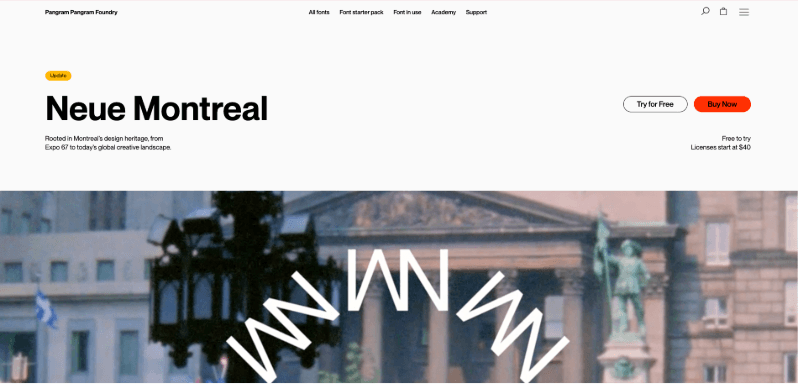
PP Neue Montreal is a contemporary grotesque from Pangram Pangram Foundry, built for branding, editorial, and digital work. It's one of the most recognizable typefaces in modern studio and portfolio design.
Why Choose
PP Neue Montreal
?
Fits the modern studio look right away
Striking in oversized, tightly tracked titles
Balanced enough for body text too
Gives portfolios a design-literate feel
Free trial files let you test before buying
Pairs naturally with PP Editorial New
Key Features
Weights from Hairline to Black
Italics for every weight
Dedicated Text cut for long-form reading
Neo-grotesk construction
PP Neue Montreal Mono companion
Desktop and web licenses
💡 Framer Pro Tip: Upload paid fonts in the Custom tab of Framer's font picker. Check that your license covers web use, and upload only the weights you use to keep pages fast.
PP Editorial New

Best For:
Fashion, luxury, and editorial brands
Type:
Premium
PP Editorial New is a narrow, precise serif from Pangram Pangram, made for long-form content but bold enough for headlines. Its lighter weights feel refined and retro, which is why fashion and beauty brands love it.
Why Choose
PP Editorial New
?
Brings magazine-cover sophistication
Italic headlines feel artful and deliberate
Light weights look refined at huge sizes
Great for photography-led layouts
Stands out against sans-heavy competitors
A proven pairing with grotesk body fonts
Key Features
Weights from Thin to Ultrabold
Expressive matching italics
Narrow serif proportions
Mid-90s editorial character
Variable font version
Free-to-try files for personal use
Aeonik

Best For:
Tech brands, SaaS, and fintech
Type:
Premium
Aeonik from CoType Foundry combines the precision of a neo-grotesque with rounder, geometric letterforms. Its clean, mechanical look is trusted by brands like Revolut and Alipay.
Why Choose
Aeonik
?
Polished alternative to free sans fonts
Scales smoothly across UI and marketing pages
Geometric touches keep it contemporary
Builds trust for fintech and B2B brands
Sub-families add headline flexibility
One cohesive system for an entire brand
Key Features
Eight weights with matching italics
Mono, Fono, Condensed, and Extended sub-families
Closed apertures and perpendicular stroke endings
Tabular and old-style numerals
Built-in arrows and fractions
Latin, Greek, Cyrillic, and Vietnamese support
GT Walsheim

Best For:
Consumer apps, startups, and friendly brands
Type:
Premium
GT Walsheim from Grilli Type is a geometric sans serif by Noël Leu, inspired by Otto Baumberger's 1930s Swiss poster lettering. Its warm curves make it a friendly but precise choice for consumer brands.
Why Choose
GT Walsheim
?
Approachable tone for consumer products
Memorable shapes that help headlines stick
Balances playfulness with professionalism
Used by many well-known tech brands
Works for both logos and interfaces
Free trial fonts for client mockups
Key Features
Weights from Ultra Light to Ultra Bold
Matching obliques
Condensed version available
Distinctive capital "G" with a jutting bar
Full Cyrillic support
Desktop, web, and app licensing
Söhne

Best For:
Product sites, AI companies, and editorial platforms
Type:
Premium
Söhne from Klim Type Foundry is described as the memory of Akzidenz-Grotesk seen through the reality of Helvetica. It recreates the "Standard Medium" feel of Unimark's NYC Subway signage for a refined, understated voice.
Why Choose
Söhne
?
Quietly premium feel for product brands
Excellent readability in long interfaces
Width variants solve tricky layout problems
Gives a site a credible, design-led tone
Timeless rather than trendy
Pay once, use forever (no subscription)
Key Features
Söhne, Breit (wide), and Schmal (condensed) families
Söhne Mono companion
64 styles across the collection
Italics throughout
Manual hinting and kerning
Desktop, web, and app licenses
Canela

Best For:
Luxury, hospitality, and lifestyle brands
Type:
Premium
Canela from Commercial Type is a display typeface by Miguel Reyes that sits between serif and sans. It started as an interpretation of Caslon and evolved into forms with only faint flaring at the stroke ends, influenced by stone carving.
Why Choose
Canela
?
Ideal for hotels, restaurants, and boutiques
Elegant in both light and bold weights
Stands apart from typical high-contrast serifs
Adds warmth to minimal layouts
Makes short headings feel handcrafted
Suits image-heavy, spacious designs
Key Features
Thin to Black weights
Italics throughout
Deck version for 20–48pt subheads
Text version with small caps and tabular figures
Condensed and Arabic companions
Web licensing via Commercial Type
ABC Diatype

Best For:
Design studios, cultural organizations, and startups
Type:
Premium
ABC Diatype from Dinamo is a warm yet sharp grotesque made for reading on screen. Its name refers to the pre-digital typesetting machines that shaped its forms and the Swiss neo-grotesque genre.
Why Choose
ABC Diatype
?
One family for every text role on a site
Swiss feel without looking cold
Mono variant suits technical details
Popular with studios and cultural institutions
Readable across long content pages
Trial fonts available before buying
Key Features
Thin to Bold weights with italics
Diatype Mono and Semi-Mono variants
Diatype Rounded companion
Schoolbook stylistic set
Single-storey "a" and tombstone-style "t" alternates
Broad Latin language support
Gilroy

Best For:
Marketing sites, app landing pages, and presentations
Type:
Premium
Gilroy by Radomir Tinkov is a modern sans serif with a geometric touch and a younger sibling to his Qanelas family. Two weights are free, so you can test it on a real project before licensing the full family.
Why Choose
Gilroy
?
Punchy heavy weights for conversion headlines
Geometric style most audiences find familiar
Light and bold needs covered in one family
Common choice for app marketing
Budget-friendly premium option
Consistent across website and pitch decks
Key Features
20 styles: 10 weights with matching italics
Weights from Thin to Heavy
Cyrillic language support
Fractions and tabular figures
Built-in arrows and ligatures
Web and desktop licensing
Graphik

Best For:
Enterprise sites, publishing, and UI-heavy products
Type:
Premium
Graphik from Commercial Type, designed by Christian Schwartz, is a deliberately plain editorial workhorse and one of the foundry's most popular families. It combines the round bowls of a geometric sans with the proportions of a European grotesk.
Why Choose
Graphik
?
Dependable for large, content-heavy sites
Neutral but warmer than Helvetica
Width options handle complex layouts
Trusted by major publishers and brands
Readable at small UI sizes
A long-term choice that won't date quickly
Key Features
Wide weight range with italics
Compact, Condensed, and Wide versions
Extra-condensed widths down to XXXX Condensed
Graphik Arabic companion
Geometric-grotesk hybrid design
Web licensing via Commercial Type
Quick picks
For SaaS and product sites: Inter, Manrope, or Söhne
For portfolios and agencies: Satoshi, Clash Display, or PP Neue Montreal
For editorial and blogs: Instrument Serif, Zodiak, or PP Editorial New
For luxury and lifestyle brands: Canela or Cabinet Grotesk
For consumer apps: GT Walsheim or Gilroy
Conclusion
The right font can decide whether a Framer site feels generic or memorable. Free options like Inter, Satoshi, Manrope, and Clash Display cover most product, startup, and portfolio needs straight from Framer's font picker. Instrument Serif, Cabinet Grotesk, and Zodiak bring editorial character without a license fee.
When a brand needs a more distinctive voice, premium typefaces are worth the investment. PP Neue Montreal and ABC Diatype suit creative studios, Aeonik, Söhne, and Graphik give tech and enterprise brands a polished feel, and Canela, PP Editorial New, GT Walsheim, and Gilroy add personality for luxury, fashion, and consumer brands.
Looking for inspiration for your next Framer project? Explore professionally designed Framer templates and see how typography, layout, and visual design come together in real website designs.


