How to Make a Component in Framer
Build reusable Framer components from scratch - canvas-based design components or React code components with full property controls.

If you're building anything beyond a single landing page, you'll hit the same problem fast: the same button, card, or nav bar showing up on ten different frames, and no clean way to update all ten at once. That's what a Framer components solves. It turns a piece of design into a reusable, editable master — change it once, and every instance across your project updates with it.
The catch is that "component" means two different things in Framer, and mixing them up is the most common source of confusion for people getting started.
Two Types of Components in Framer
Before building anything, it helps to know which kind you actually need:
Design (canvas) component - built visually, directly on the canvas, the same way you'd build a component in Figma. Best for repeatable UI pieces like buttons, cards, and navigation bars.
Code component - built with React and TSX, giving you real props, logic, and custom behavior. Best for things a visual canvas can't easily do: custom sliders, animated widgets, CMS-driven cards with conditional logic.
Most projects use both. Design components handle the everyday reusable UI. Code components step in when you need something the canvas genuinely can't build on its own.
How to Make a Design Component (Canvas)
This is the most common path, and it's entirely visual - no code required.
Build the layer first. Design the element the way you want it on the canvas - text, image, stack, whatever the piece needs.
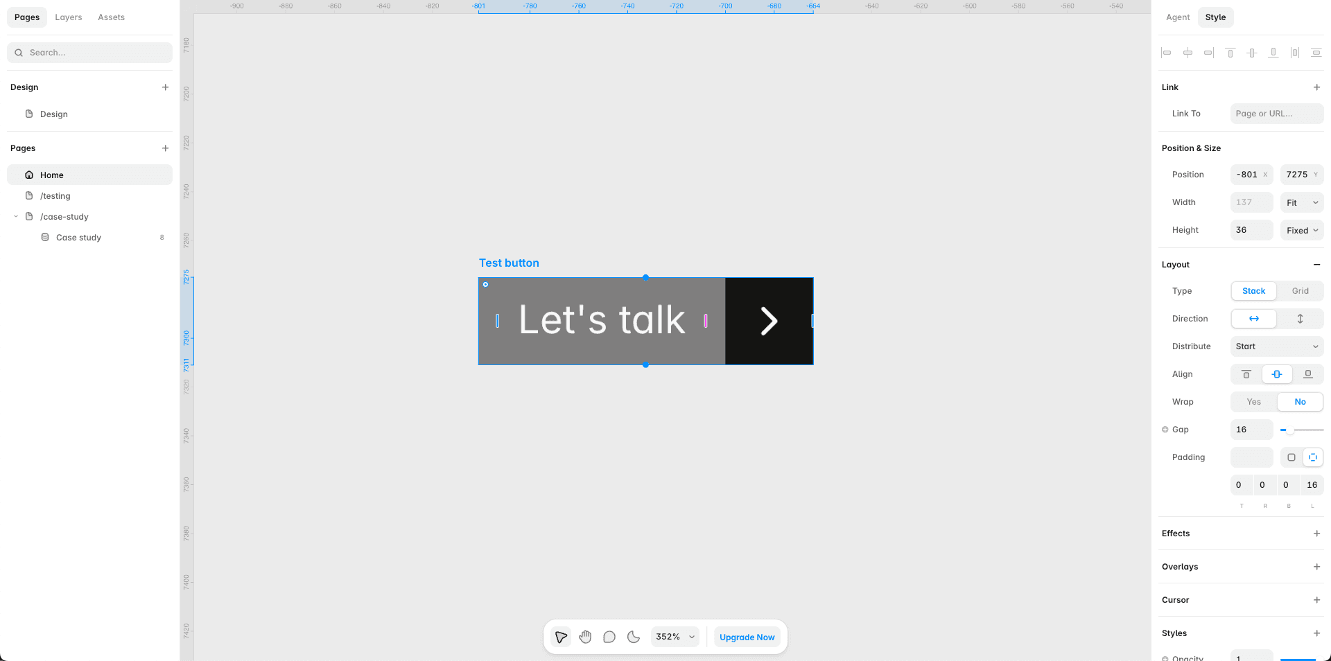
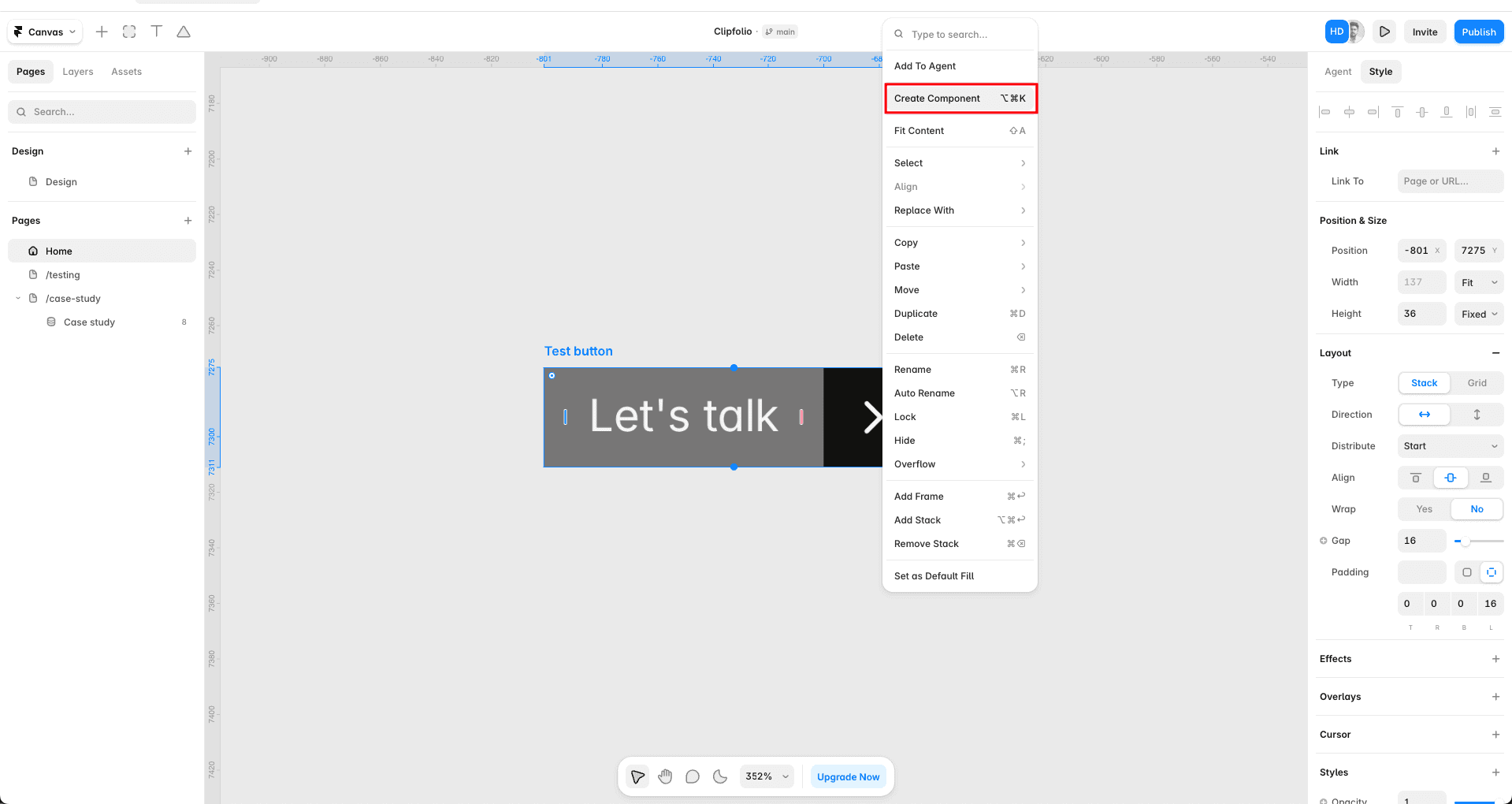
Select it and create the component. Right-click and choose Create Component, or use the keyboard shortcut. Framer opens a dedicated component canvas for it.
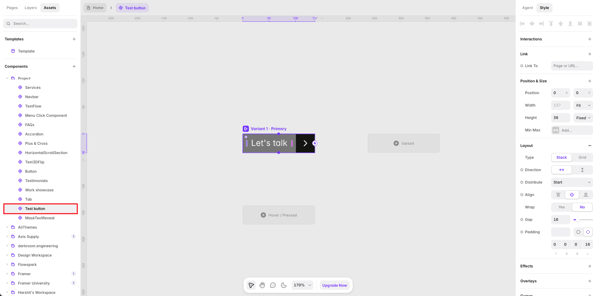
It becomes a master. The component now lives in your Assets panel under Components - this is the source of truth for every future instance.
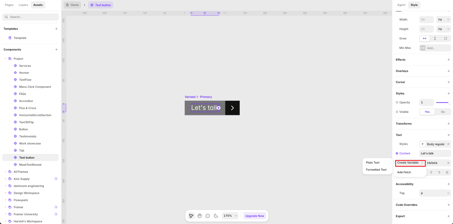
Add properties so instances stay flexible. Select a layer inside the master (a text layer, for example), and connect its content, image, or visibility to a property. This is what lets each instance show different text or an image without touching the master design.
Drag instances wherever you need them. Pull the component from the Assets panel onto any page or frame. Edit the master and every instance updates - unless a specific instance has a local override, in which case that override stays untouched.
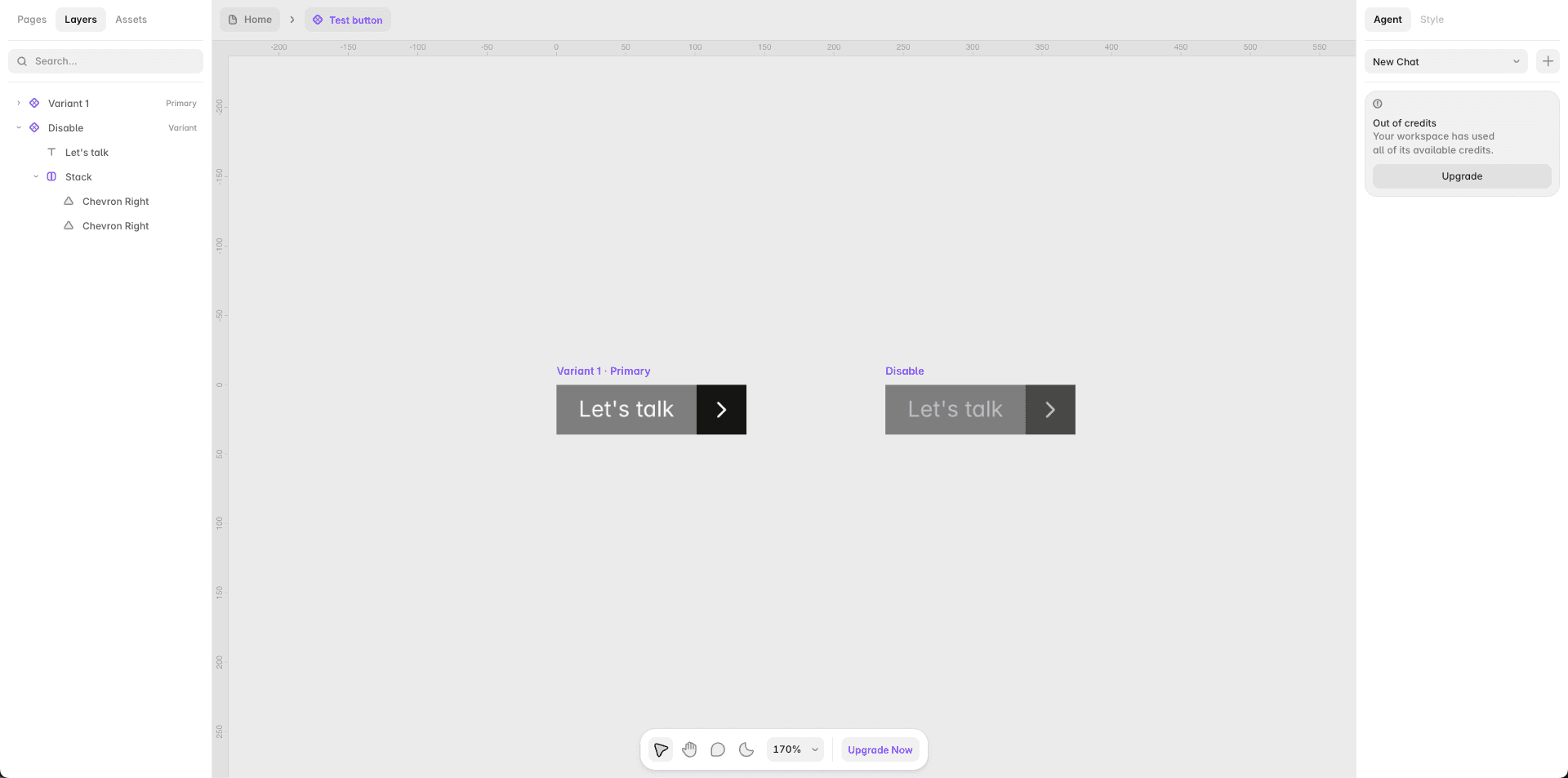
Use variants for different states. Add variants for things like Default/Hover/Press or Small/Large, and manage them all inside one component instead of duplicating the design for every state.
How to Make a Code Component
Reach for this when you need real interactivity or logic that a static canvas layout can't express on its own.
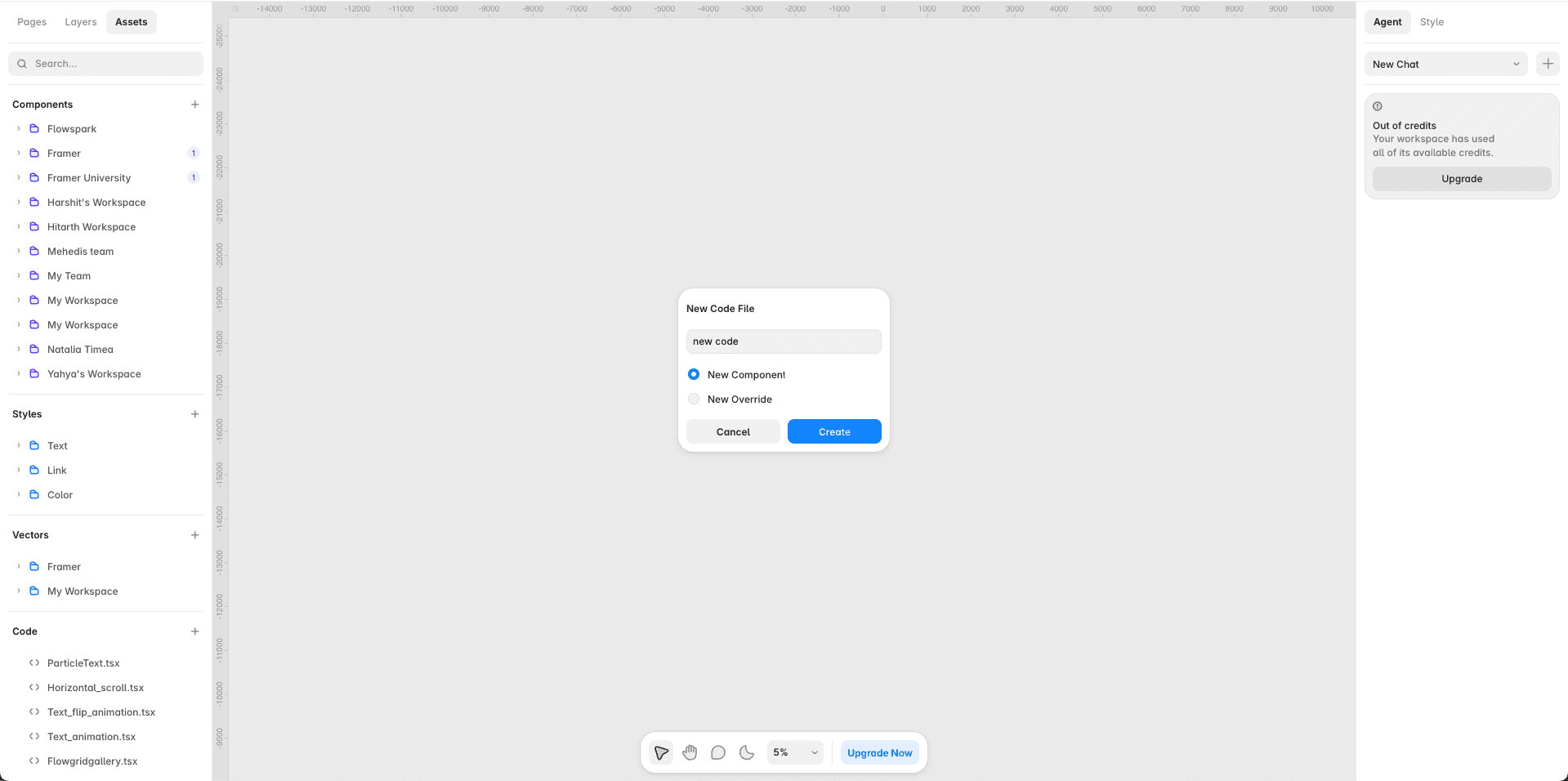
Open a new code file. In the Assets panel, go to Code and create a new code file.
Start from the scaffold. Framer generates a .tsx file with a basic React functional component already in place.
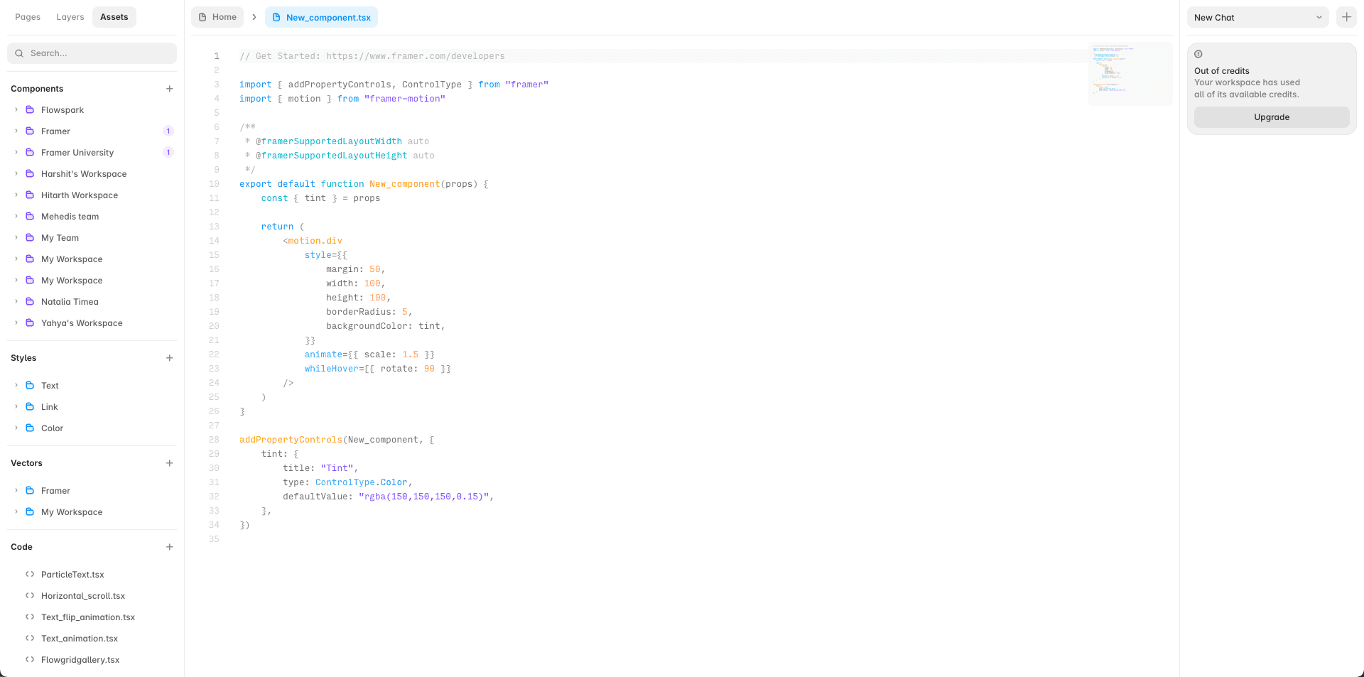
Expose props with addPropertyControls. Import addPropertyControls and ControlType from the framer library, then define which properties should be editable from the canvas - text, color, number, boolean, image, and more. This is what turns a plain React component into something a non-developer can adjust visually.
Save it. The component appears in the Assets panel and can be dragged onto the canvas exactly like a design component.
Style and animate as needed. Use standard CSS-in-JS or utility-style patterns, and Framer's built-in Motion tooling for animation - you don't need to install a separate animation library.
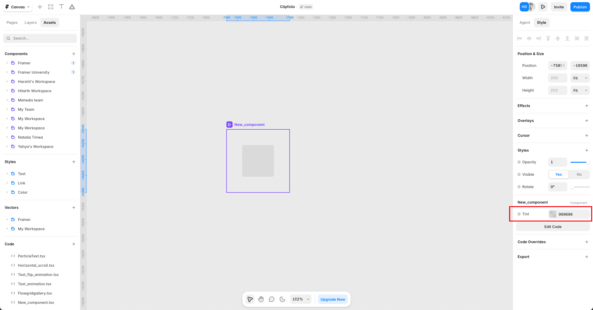
Test the exposed props. Select the component on the canvas and adjust its properties from the right sidebar, checking that sizing behavior (fixed, fill, or hug) responds the way you expect.
Best Practices for Both Component Types
A few habits separate a component that scales cleanly from one that turns into a maintenance headache:
Use Stacks (auto layout) inside components so they resize responsively instead of relying on fixed pixel positions.
Only expose what should actually be editable. Every property you add is one more thing someone else has to understand - don't expose internal structure that should stay locked.
Name layers clearly. Layer names become the labels for props and overrides in the properties panel, so vague names make a component harder to use later, including for you.
Prefer variants over duplicate components. If you're building three near-identical buttons for three states, that's a variant problem, not three separate components.
Publish shared components to a team library if more than one project needs them - this keeps a single source of truth across your whole workspace instead of copy-pasted, drifting versions.
Version carefully. A change to a master component pushes to every instance across every project using it. Preview and test before publishing changes live, especially on components already in production use.
Design Component vs. Code Component: Quick Reference
Design Component | Code Component | |
Built with | Canvas (visual) | React / TSX |
Best for | Buttons, cards, nav bars, repeatable layout pieces | Custom interactions, sliders, CMS-driven logic, widgets |
Requires code | No | Yes |
Customization | Property connections, variants | addPropertyControls, full component logic |
Who typically builds it | Designers | Developers (or designers using AI-assisted code) |
Which One Should You Start With?
If you're not sure which path to take, start with a design component. It covers the majority of what most sites need - consistent buttons, cards, and navigation - without touching code. Reach for a code component only when you hit something a visual layout genuinely can't do: real conditional logic, an interaction the canvas doesn't support natively, or a widget that needs to talk to an external API.
Either way, the underlying goal is the same: build the piece once, expose only what should change, and let every instance inherit the rest automatically.
Final Thoughts
Learning how to create a Framer code component is one of the easiest ways to make your design workflow more efficient.
For most reusable visual elements, Design Components provide everything you need. When you need custom logic, advanced interactions, or more control over component behavior, Code Components give you a more powerful option.
The key is to build components with reuse in mind. Keep their layouts responsive, expose only useful properties, use variants for meaningful states, and test them before using them throughout your project.
Once you start building with reusable components instead of individual elements, creating and maintaining Framer websites becomes much faster and more consistent.


